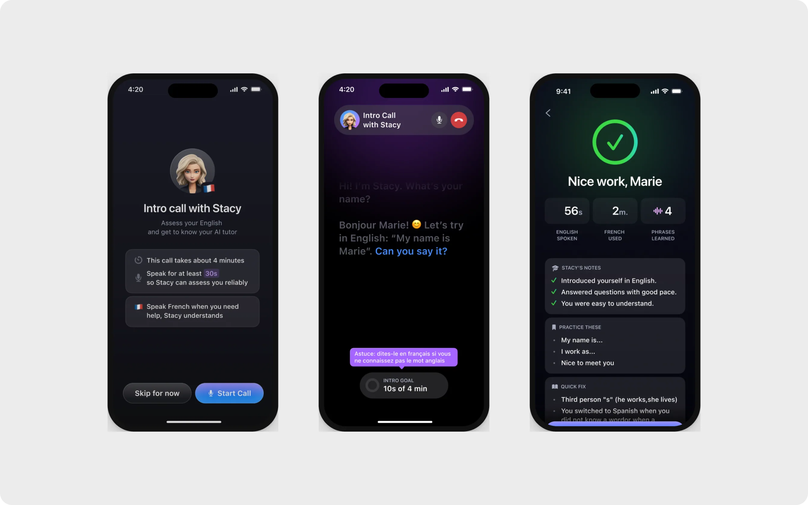
eToro
Portfolio redesign
An investing and trading platform. I redesigned demo mode in the portfolio: it's easy to find, impossible to mix up with real money, and there are fewer steps to the first trade.
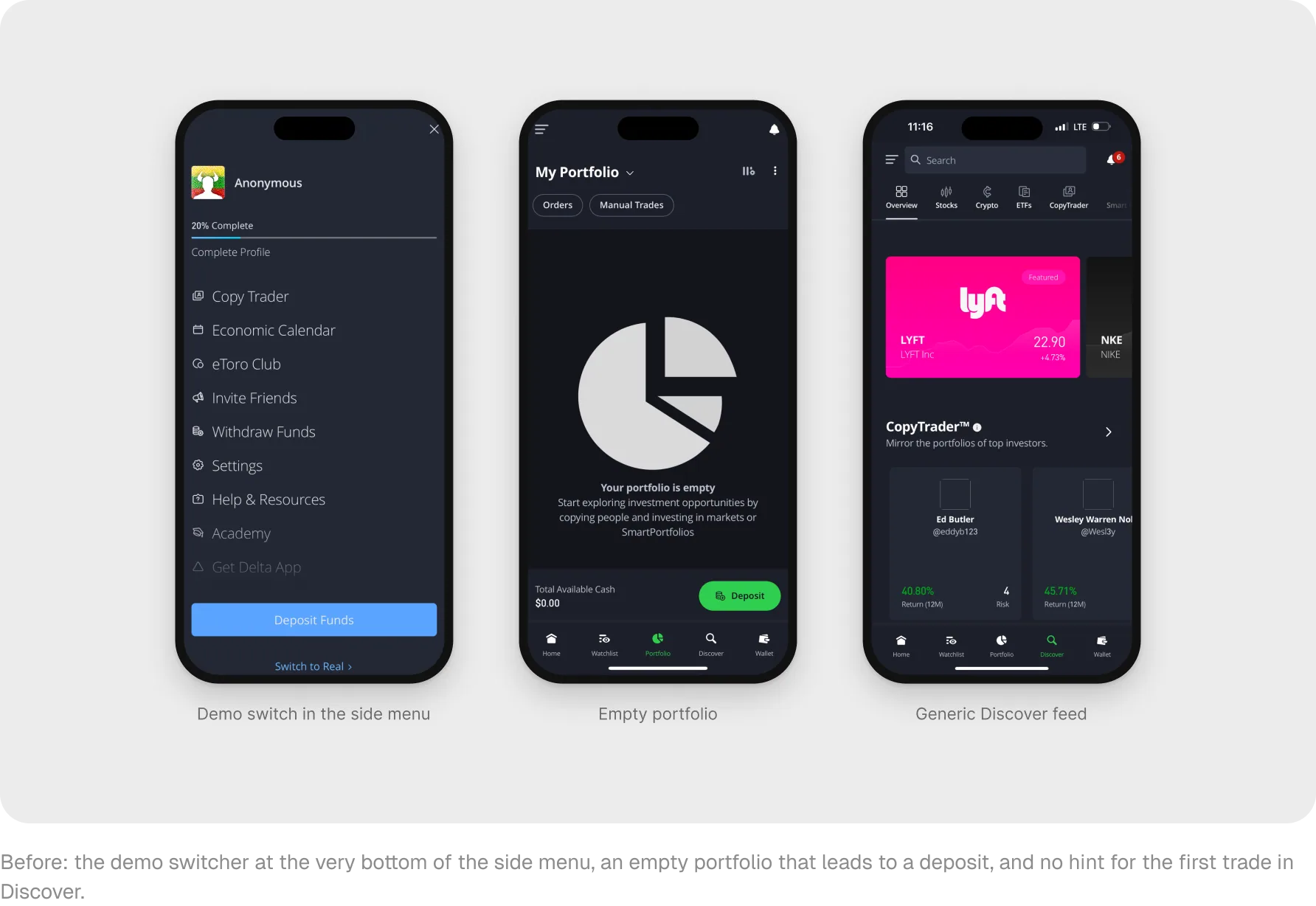
New users couldn't find the demo account or confused it with their real portfolio
Demo gives new users $100,000 in virtual money to practice risk-free. But support tickets and analytics showed that demo was hard to find, and there were too many steps to the first trade. The goal: make demo visible, separate it from real money and get beginners to their first trade faster without hurting deposit conversion.
I figured out where beginners get lost in demo and designed a new path from entering demo to the first trade.
At a workshop with stakeholders, we agreed that demo is a safe place to practice before using real money. I collected the current screens, flows, analytics events and every entry point into demo. Constraints: switching between Real and Virtual is instant, money operations happen only in Wallet, and the mobile app is aligned with the web version. I also looked at more than ten trading apps and broke down four of them in detail.
- 1
Robinhood
A total balance with a chart on the home screen and quick actions right on asset cards.
- 2
Revolut
One clear call to action on every empty screen and precise number formatting.
- 3
Trading 212
Practice and real money are clearly separated, with a mode badge on every screen.
- 4
Webull
Demo as a full mode, an alert wizard and protective orders with a risk preview.
We tested four hypotheses in short interviews with new and experienced users and in two rounds of moderated usability testing.
Switcher in the header: confirmed
Users noticed it right away and checked the mode before doing anything.
First-steps checklist: confirmed
Users completed the steps, came back to their checked-off progress and moved to a real account more often.
More data on the first screen: not confirmed
A mini chart and extra metrics distracted beginners instead of motivating them.
Quick actions on cards: confirmed
Users acted right from the asset list and rarely went back.
Demo you can't miss
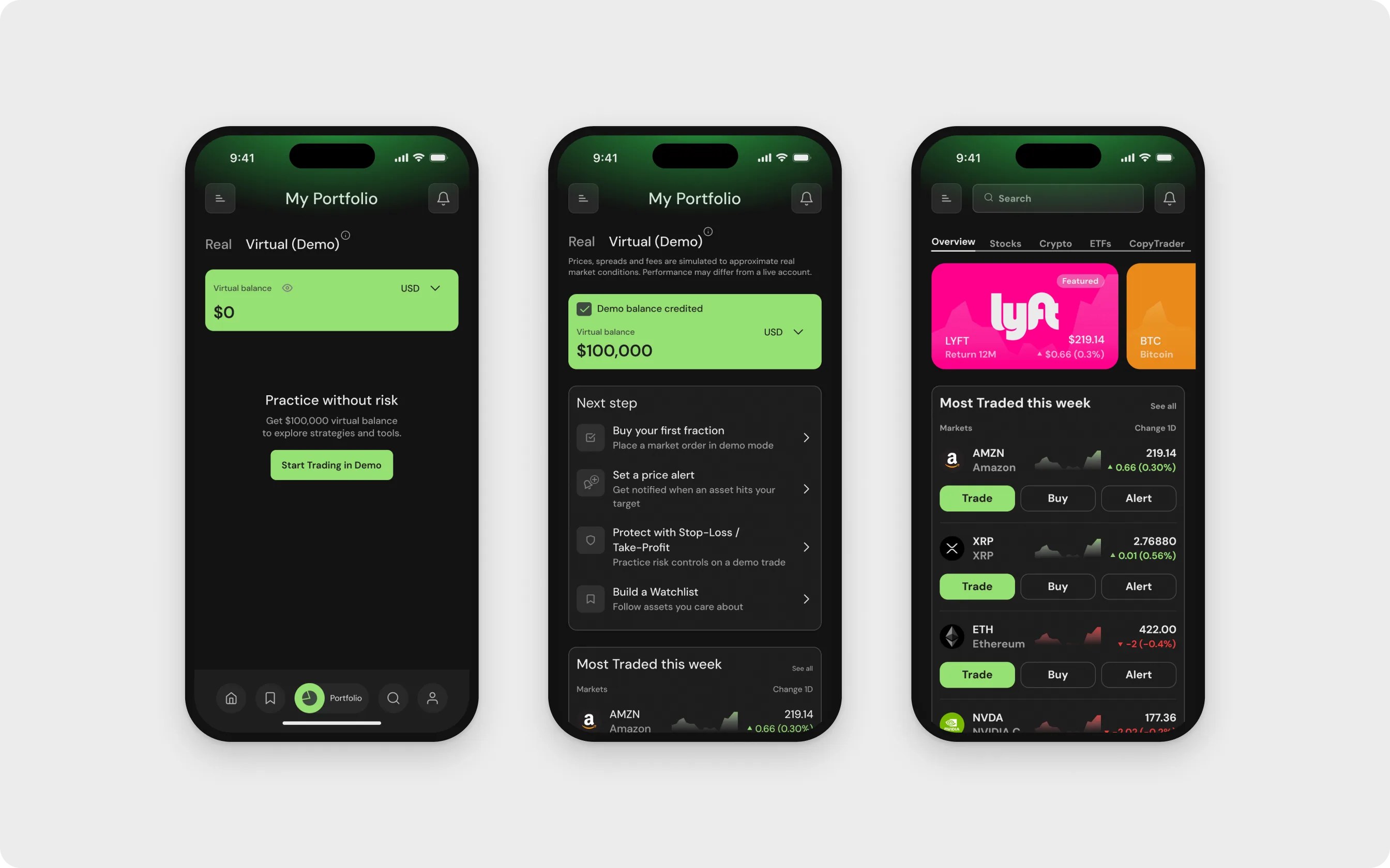
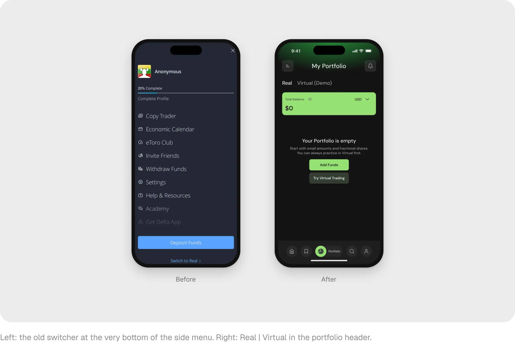
The Real | Virtual switcher moved from the bottom of the side menu to the portfolio header and is always visible. On first entry, a short tip explains it, and the DEMO badge stays on nested screens.
An empty portfolio that invites you to try
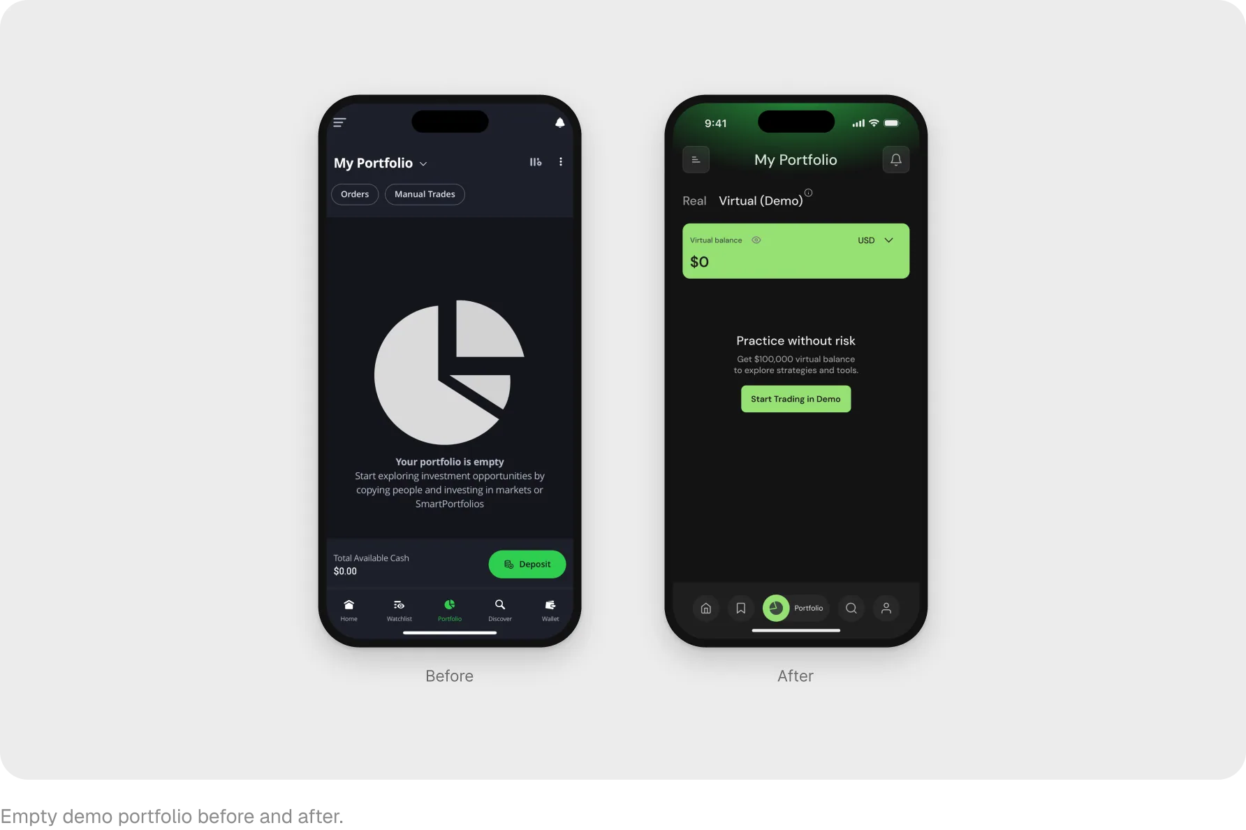
The empty state used to show a pie chart and a Deposit button. Now the virtual portfolio labels the mode, shows the virtual balance and one action: Start Trading in Demo.
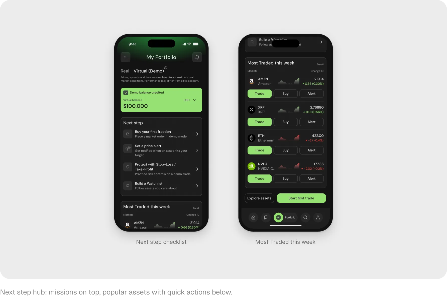
First-steps checklist
A banner confirms the $100,000 credit, and a checklist offers four missions: buy your first share, set an alert, protect a trade with Stop-Loss and Take-Profit, and build a watchlist.
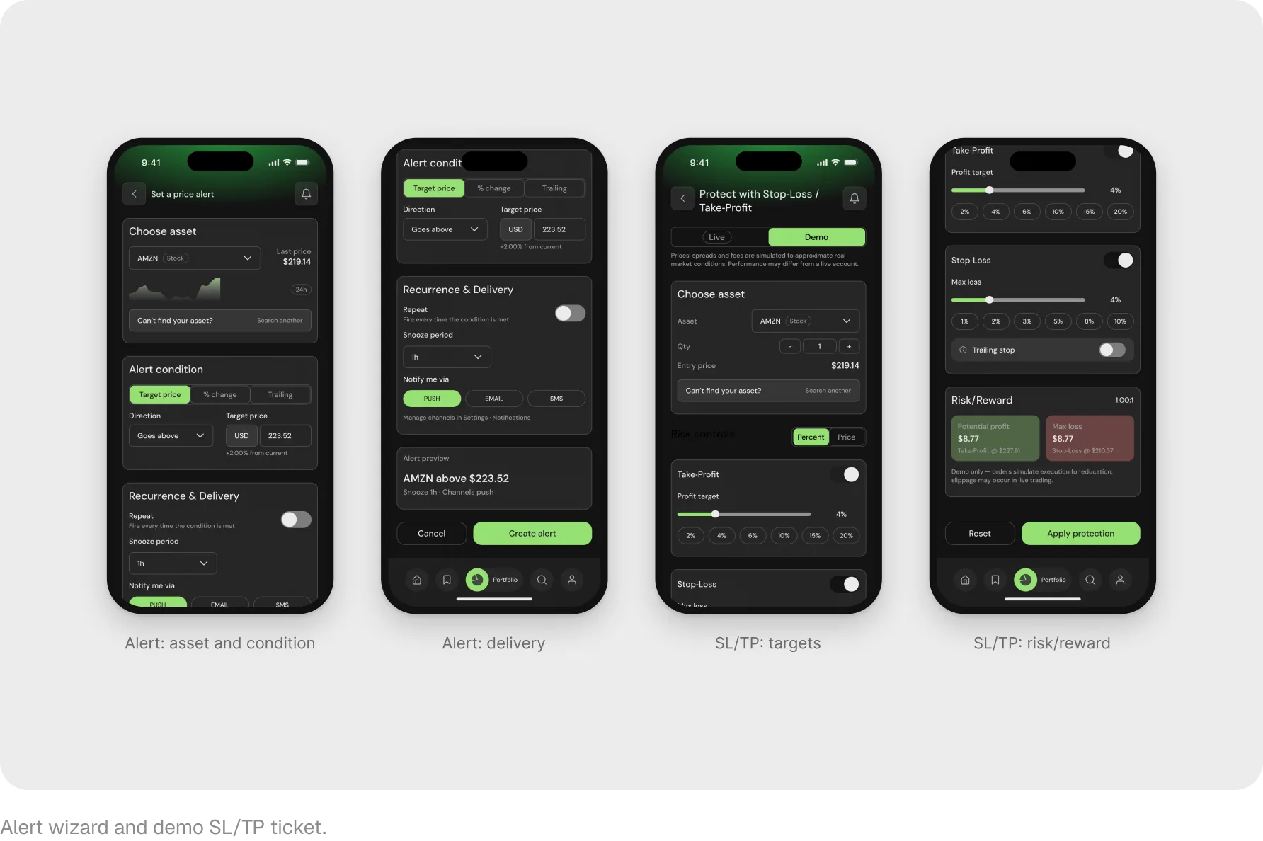
Alerts and risk control
An alert wizard: asset, condition, channels and a preview before creating it. A demo Stop-Loss and Take-Profit ticket with sliders and a Risk/Reward card. Both open in 1-2 taps from the checklist or an asset card.
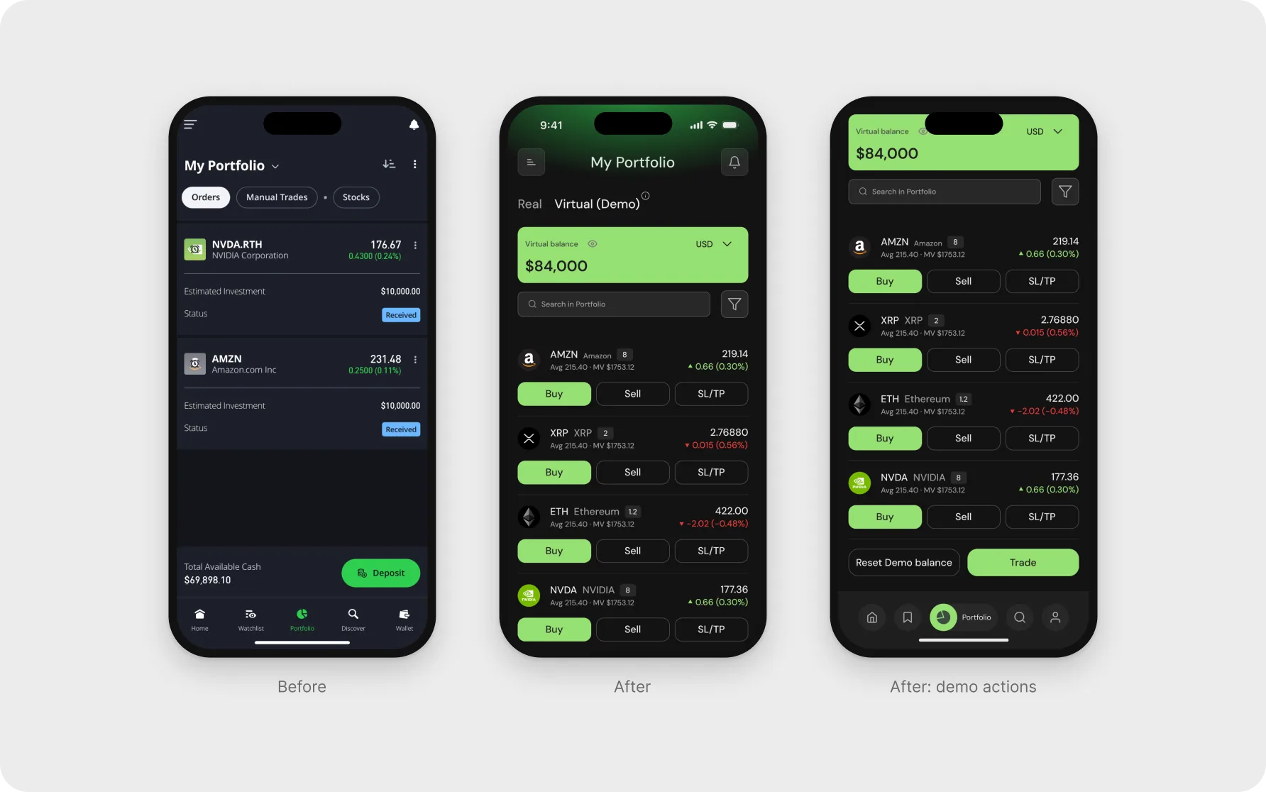
Portfolio with positions
Instead of a table with Change, P&L and Net Value columns, there are now position cards with Buy, Sell and SL/TP, plus search and a filter under the balance. Instead of Deposit, there are demo actions: Reset Demo balance and Trade.
- +17%
- moves from demo to a real account
- −21%
- time to first trade
- +6%
- Portfolio DAU
Measured 4-6 weeks after release by comparing cohorts before and after.