inDrive
Driver onboarding
An app for taxi drivers. I redesigned onboarding: while their documents are being checked, drivers go through training and then go online with one button.
Drivers signed up but never made it to their first ride
Analytics and support tickets showed that drivers dropped off at one of four points. If the first ride goes badly, we lose the driver and the passenger is left with a bad experience. The goal: shorten the time to the first ride, keep drivers engaged while their documents are checked, and reduce support requests. Drivers coming from other services shouldn't have to go through training again.
- 1
Right after sign-up
Drivers didn't know what to do next or which steps were still left.
- 2
During document checks
Verification took anywhere from a few hours to a few days, and the app stayed silent the whole time.
- 3
Going online
The home screen had a lot going on, and new drivers couldn't tell how to start getting orders.
- 4
The first order
Accepting an order, finding the passenger and completing the ride was stressful, and people made mistakes.
I ran a workshop with the PM, operations and support. We agreed that onboarding ends with the first ride, not with sign-up.
I mapped the path from downloading the app to the first ride, collected analytics events for each step and sorted support tickets by stage. I worked within constraints: design can't shorten verification time, tips had to be easy to skip, and the flow had to work on low-end Android phones and with a weak connection. I also looked at more than eight driver apps and broke down what they include in detail.
We tested four hypotheses: 10 in-depth interviews with new drivers and drivers from other apps, funnel and support ticket analysis, and two rounds of usability testing on the prototype.
“First steps” checklist: confirmed
Participants came back to the checklist after every step and always knew what was left.
Training during verification: confirmed
Drivers watched the videos while they waited, and after approval went online without contacting support.
Home screen tour for everyone: not confirmed
The tour helped newcomers but annoyed drivers from other services. Now only drivers with the “First order” label see the tips.
One-button home screen: confirmed
With a single “Go online” button, new drivers figured out on their own how to start getting orders.
“First steps” checklist
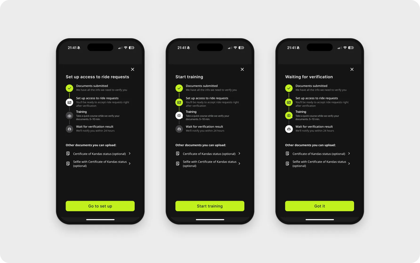
Training became a separate step. Drivers see the checklist right after submitting their documents and always know what's left.
Training during verification
Five short videos while documents are being checked. The “How to accept an order” video explains pickup and drop-off points and removes the most common first-ride mistake.
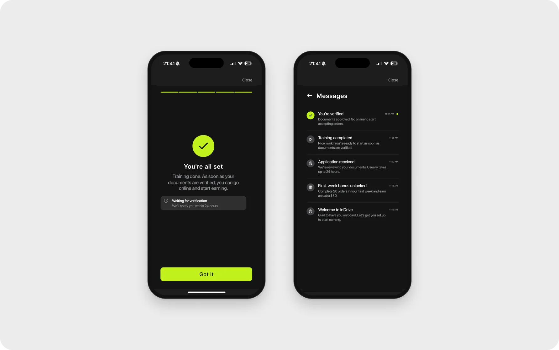
Application status in messages
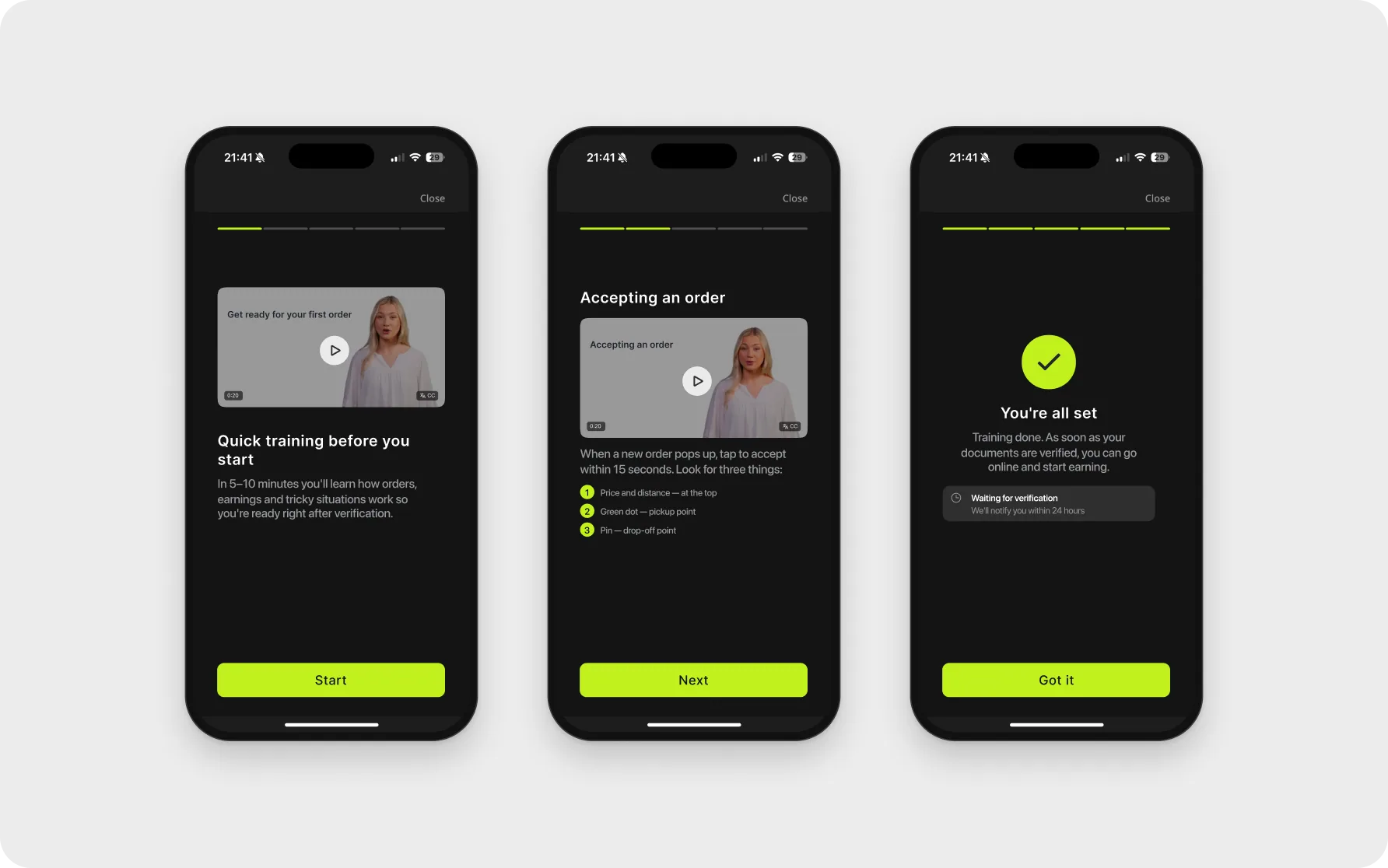
After training, drivers see what happens next. All status updates are collected in messages.
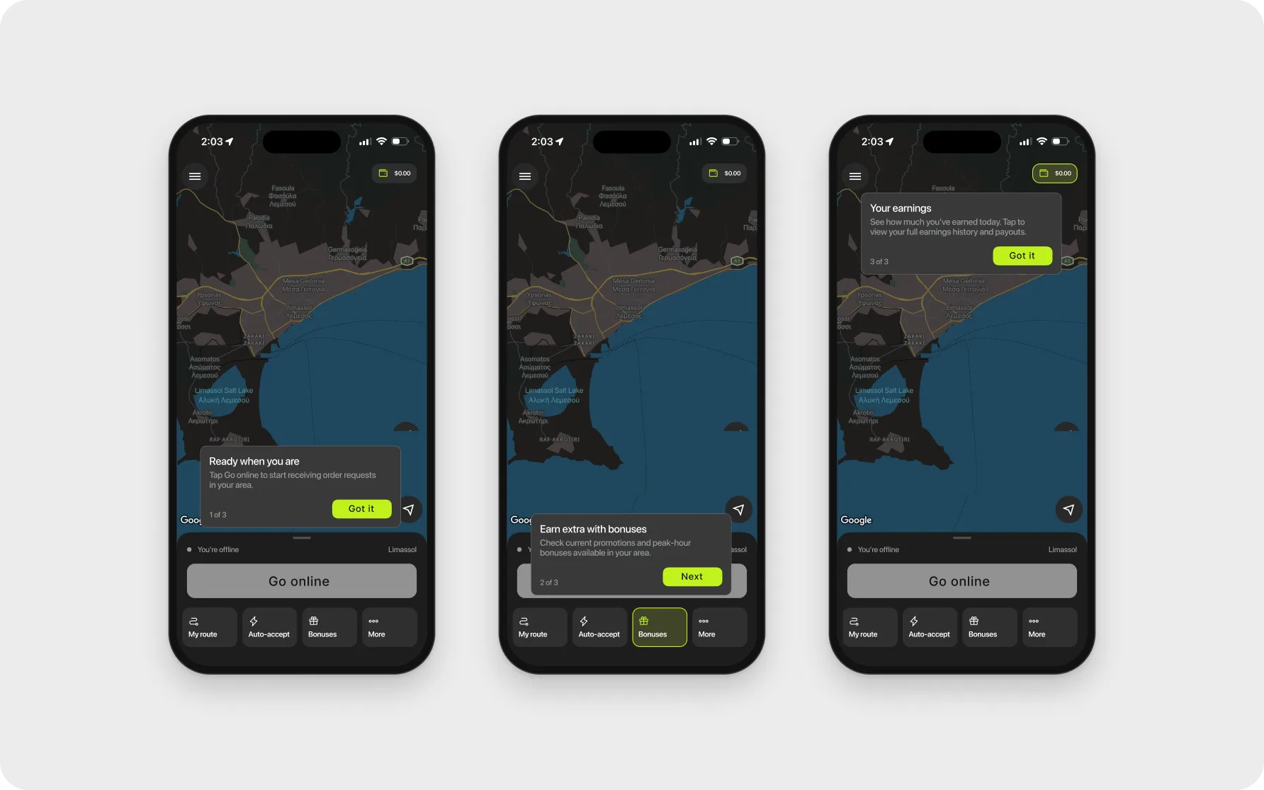
Tips for newcomers only
Home screen tips for first-time drivers: “Go online”, “Bonuses” and “Earnings”. Drivers from other services don't see them.
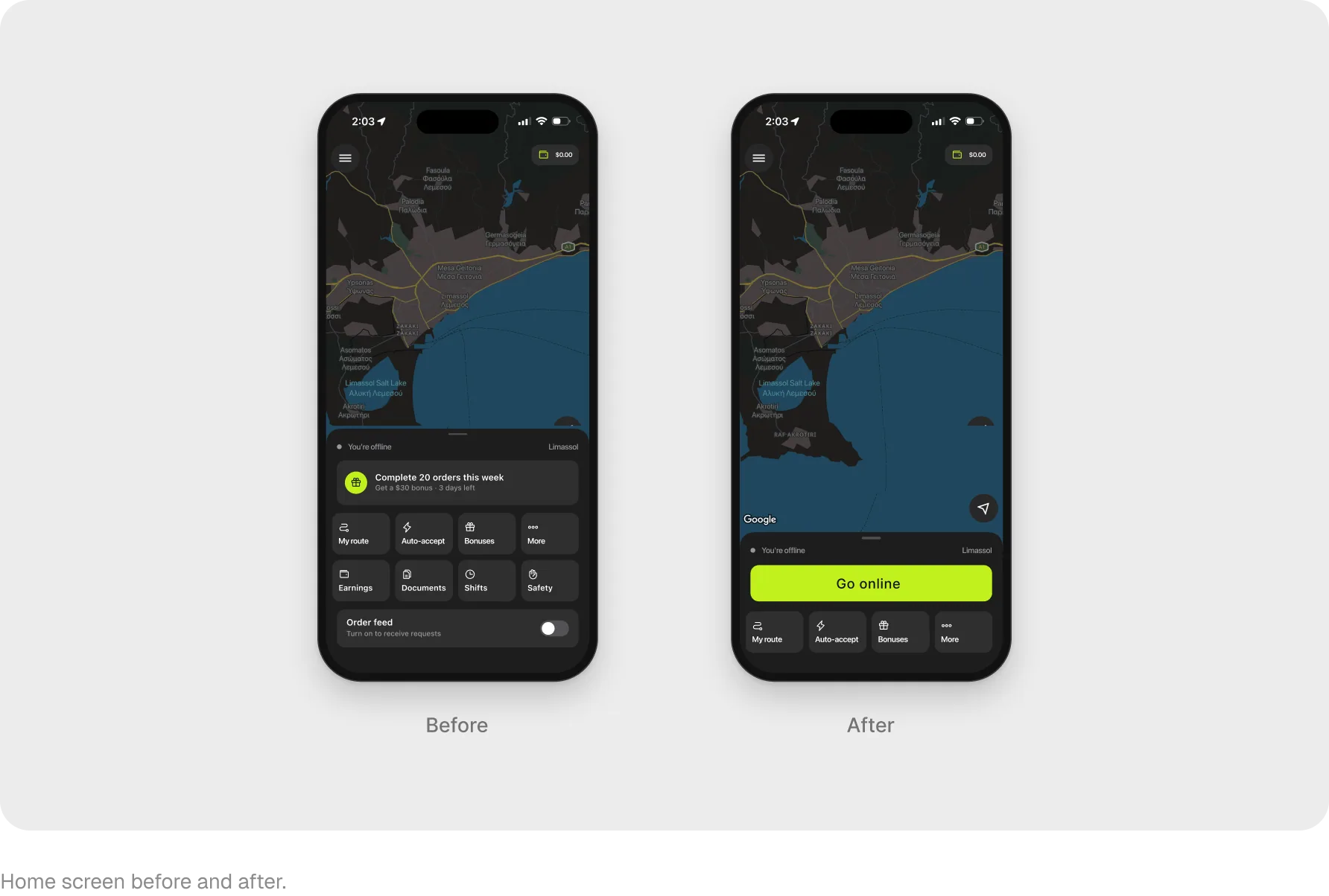
One-button home screen
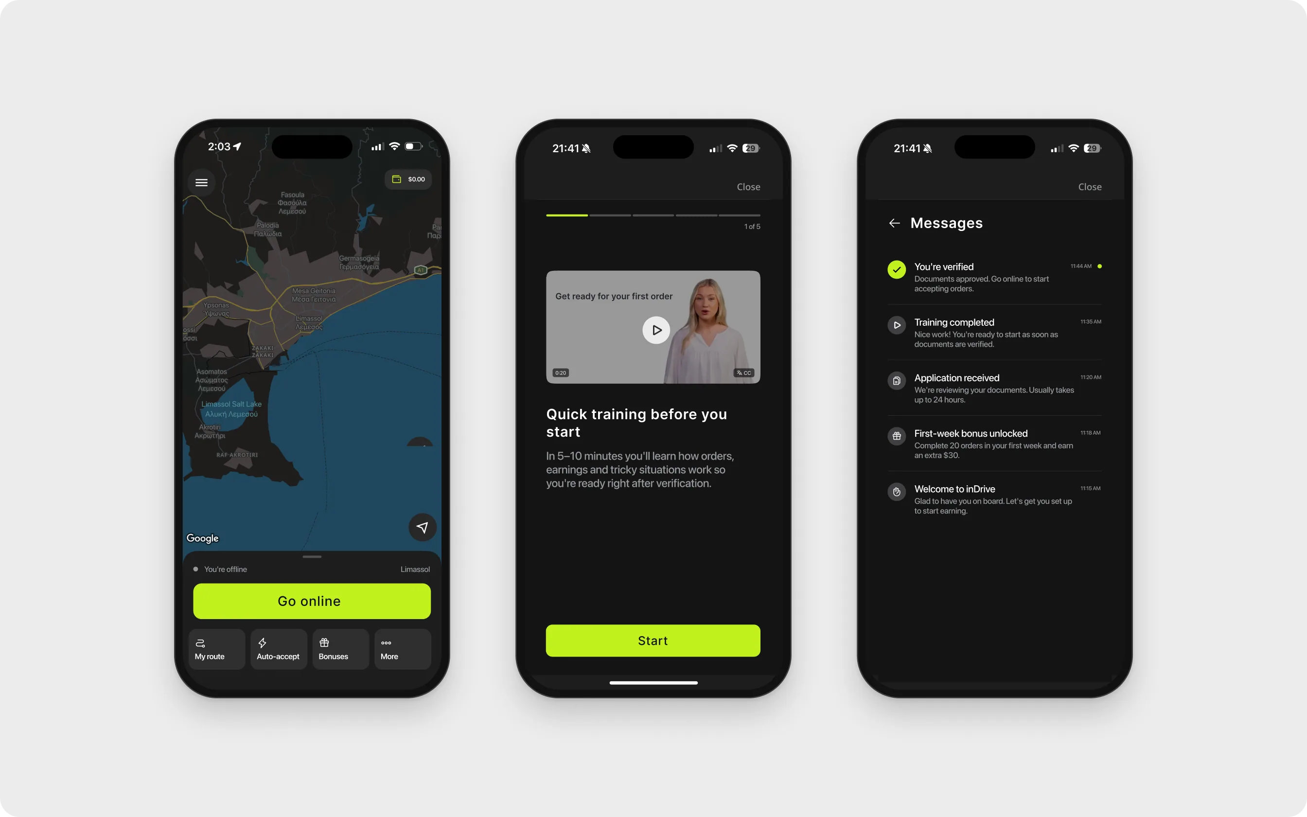
Going online used to be hidden in a small toggle at the bottom of a crowded panel. Now the home screen has a single “Go online” button with four tools below it.
Drivers now learn while they wait for verification, see their application status and start working with one button. Experienced drivers use the app as before.
Two rounds of usability testing: participants stopped asking “what now?” after sign-up and found the “Go online” button right away. Then a 50/50 A/B test on new drivers: training during verification reduced churn, tips for drivers with the “First order” label sped up first rides, and experienced drivers' activity didn't change.
- +15%
- went online within the first 24 hours
- +9%
- first-week retention
- −22%
- churn during document checks